
Are you looking to replace your armoured door and searching for inspiration on the colours to choose for the outer and inner panel?
Armoured door colours have almost no limits, because the shade is the panel’s finish and has no bearing on security.
You can choose any colour you like: it changes the outfit of your front door, not the inner structure that protects you.
The most requested armoured door colours: white, anthracite grey and black for modern spaces; wood effect and brown for warmth; blue, green and red to add character; two-tone for a designer touch.
The right colour is the one that talks to your walls, your floors and the style of your home.
Light neutrals open up and brighten small entrances, dark tones give depth and show less dirt, full colours turn the armoured front door into the focal point of the entrance.
Below you will find each colour with the style it reflects, the wall pairings and an in-depth note written by our colour designer.
Further down, the practical criteria for choosing without going wrong.
The colours for an armoured door
Every shade tells a different story and pairs with specific walls and styles.
You will find it all here: what it communicates, what it sits well with and which wall to pair it with.
If you want the scientific and historical side, open the in-depth note at the foot of each colour, written by colour designer Chiara Bevegni.
| Colour | What it communicates | Ideal style | Recommended wall |
|---|---|---|---|
| White | Light, cleanliness, openness | Minimalist, Scandinavian, classic | Tone on tone or a warm wall |
| Anthracite grey | Order, solidity, quiet elegance | Industrial, minimalist, Nordic | Light grey or powder blue |
| Black | Authority, sophistication, modernity | Minimal chic, eclectic | White or saturated pop colours |
| Wood effect / brown | Warmth, protection, welcome | Classic, rustic, warm modern | Taupe or sage green |
| Blue | Calm, depth, breathing space | Mediterranean, classic, pop | Pearl grey, air-force blue or terracotta |
| Green | Nature, balance, relaxation | Provençal, English, contemporary | White or ochre yellow |
| Red | Energy, warmth, character | Bold classic, eclectic | Mid grey or cream yellow |
| Two-tone | Design, depth, rhythm | Elegant or bold | Tone on tone or contrasting |
White armoured door
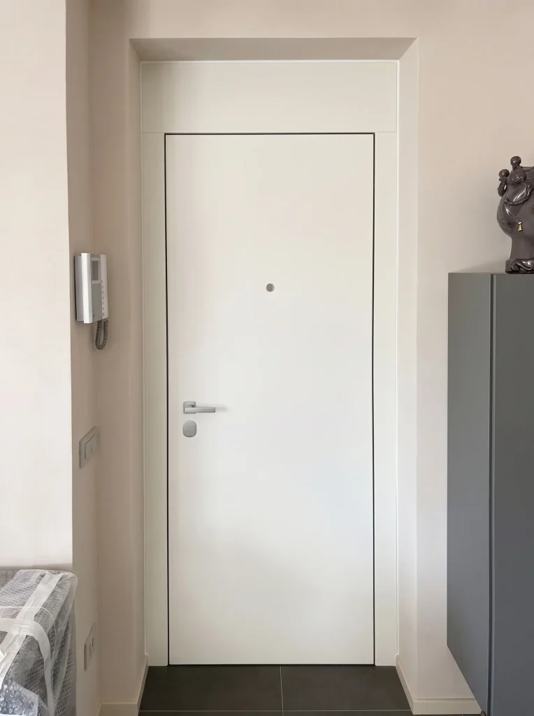
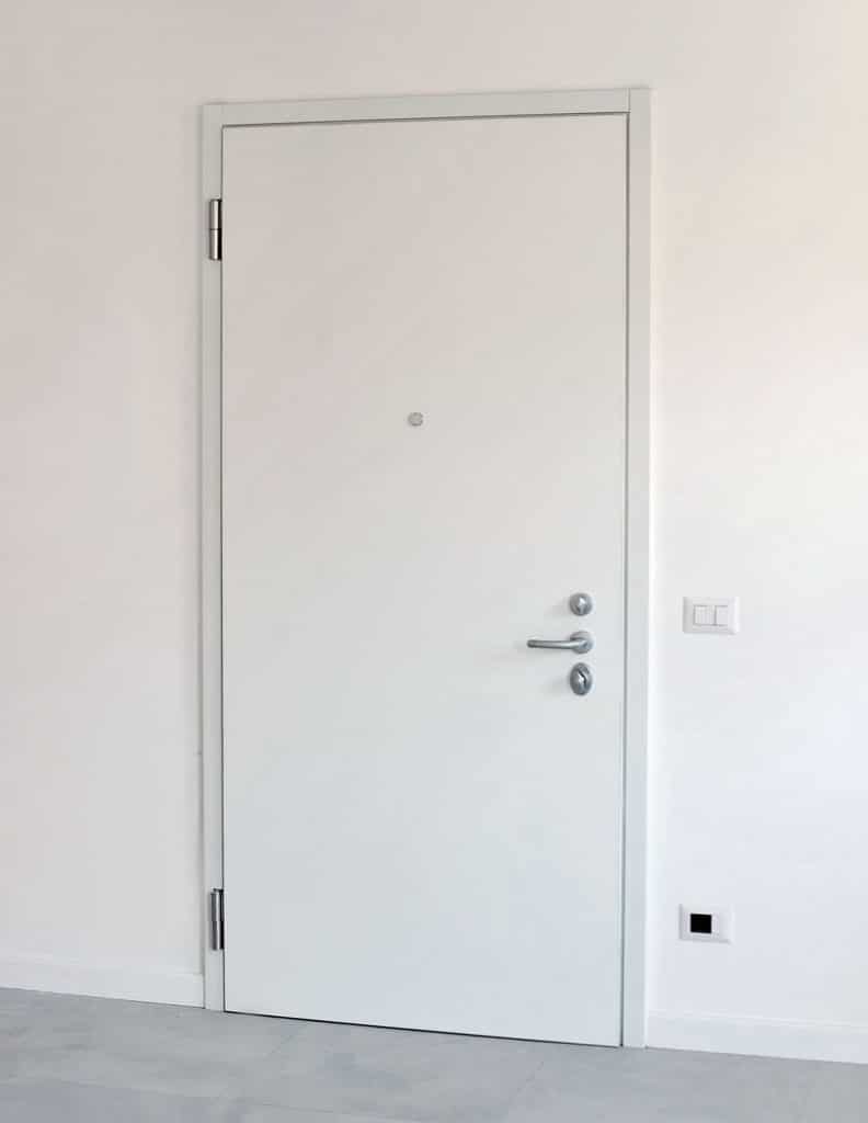
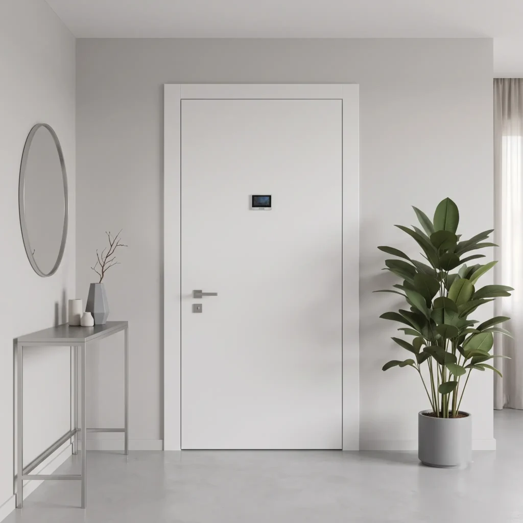
The white armoured door brings light, order and elegance, and suits almost any home, from a minimalist style to Scandinavian and right through to contemporary classic.
It looks wonderful with pared-back furniture, metal details and bright rooms. To stop it looking flat, choose a panel with grooves or geometric recesses that play with the light.
For the wall pairing you have two routes: white on white to make it disappear and widen the space, or a pure white against a wall in warm tones such as taupe or ivory to lift the doorway with a soft contrast.
More on white: perception and history
White is not just any colour: technically it is the sum of all visible light. To perceive it, the sensitive cells in our eyes all work at full stretch together, and the brain reads it as energy, brightness and openness.
On a colour chart, whites are never truly pure: they always carry a small trace of other pigments. Two white paints bought at different times may not match and, side by side, create a visible patch: it is better to fix the colour code once and for all.
Historically, white was born from a practical need, not an aesthetic one. Walls were once whitewashed with quicklime for its sanitising power, and it was the colour of humble homes. Only over time did it become a byword for cleanliness, light and newness.
Anthracite grey armoured door
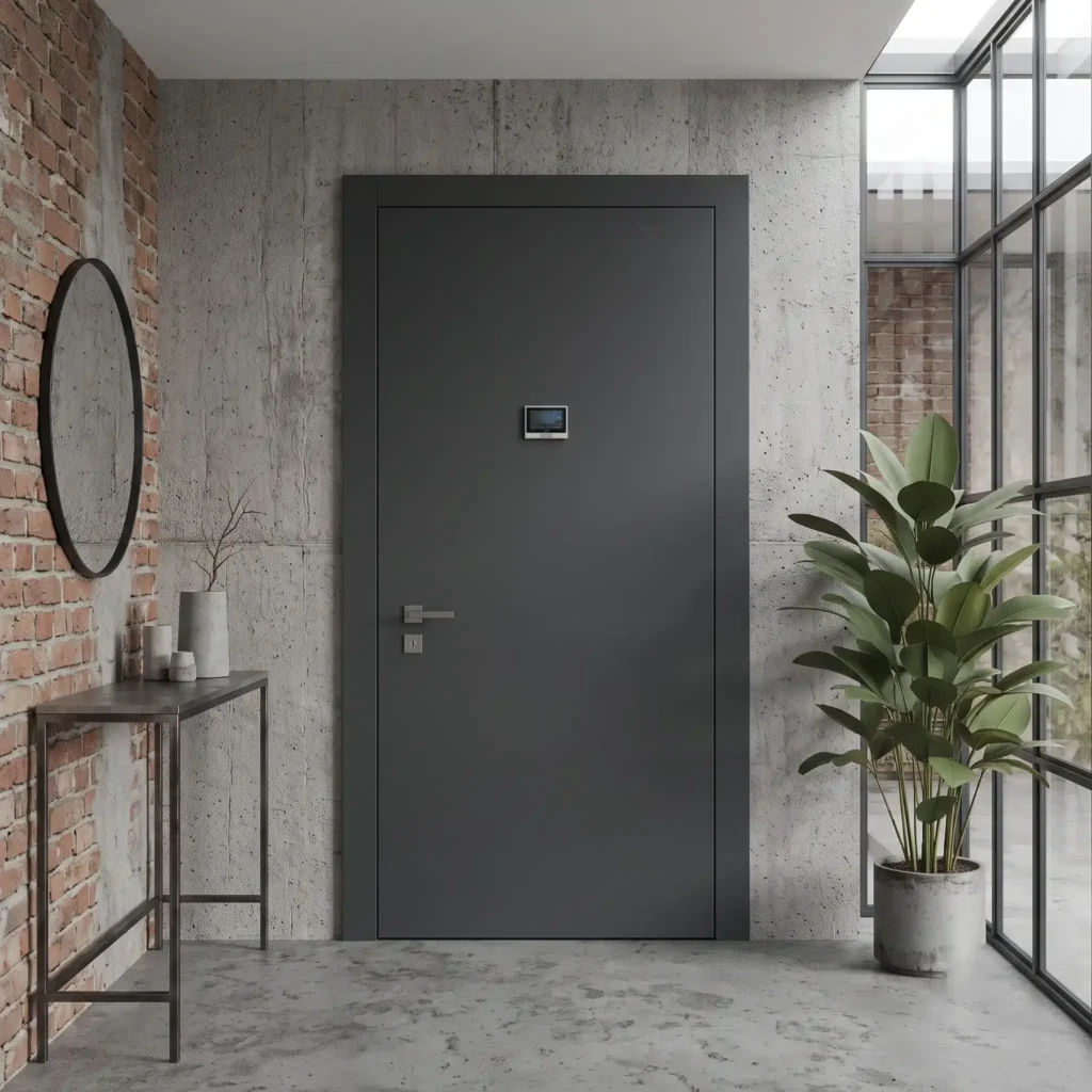
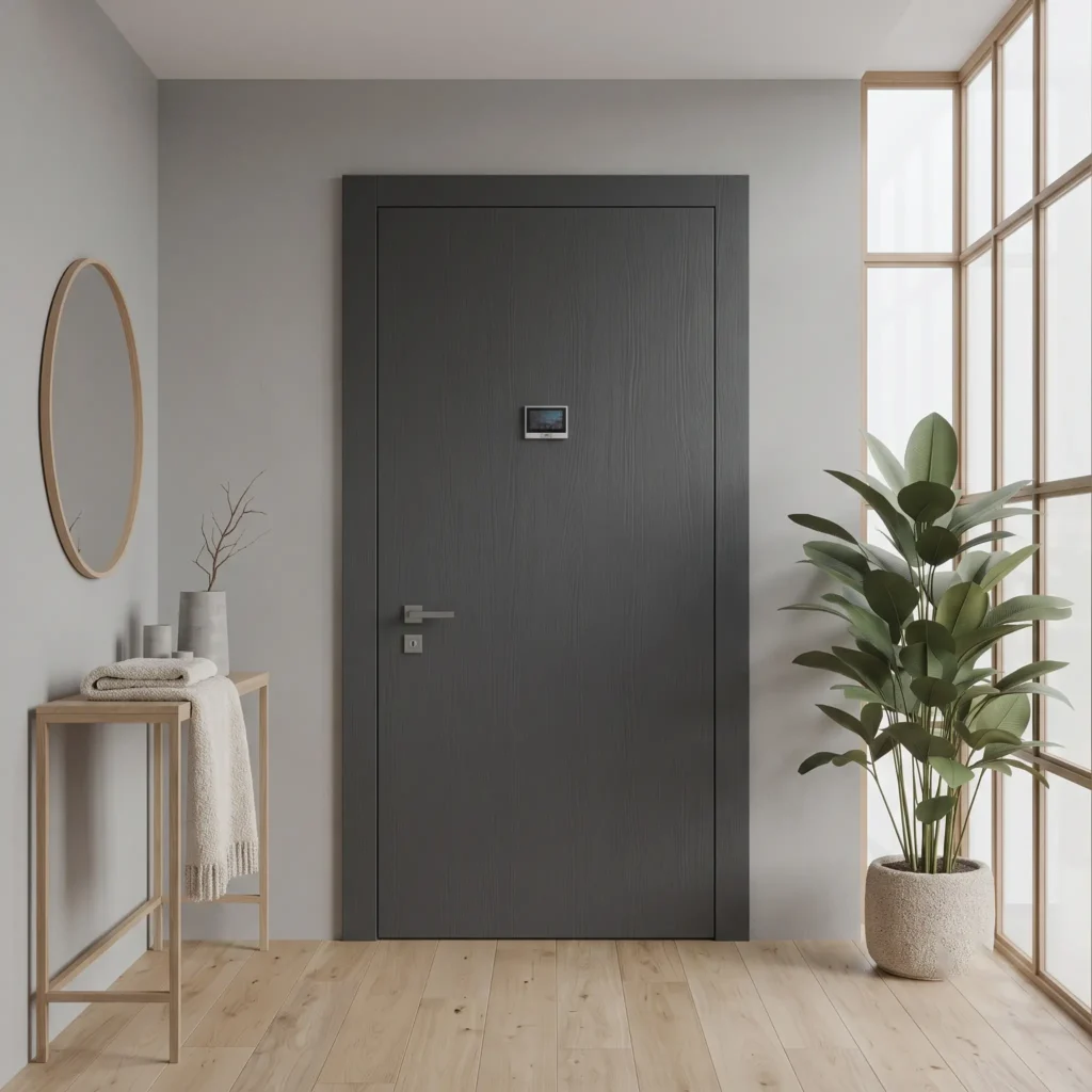
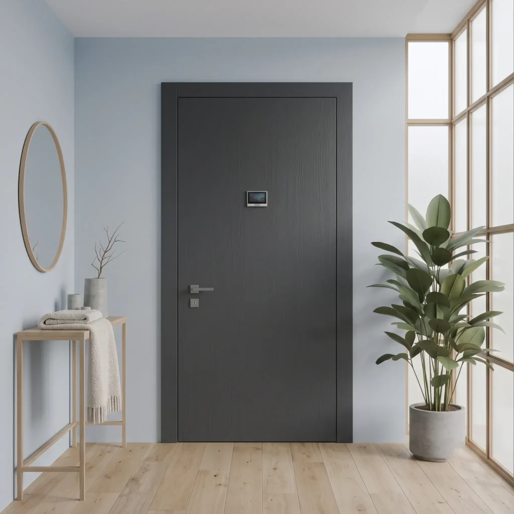
The anthracite grey armoured door is the most contemporary and orderly choice, the star of modern front doors. It communicates solidity and quiet elegance without shouting.
It pairs with industrial, minimalist and Nordic styles, alongside concrete, exposed brick, light woods and large glazing with dark frames.
Against a light grey wall it gives a sober, professional feel; against a powder blue wall it becomes warmer and more welcoming, softened by the bluish note. You will find several interpretations among our modern armoured doors.
More on anthracite grey: perception and history
Anthracite grey is a resting point for the eye. It has no wavelength of its own: it is born from the balance between white and black and reflects light in an even way, so the gaze makes no effort and immediately reads order and solidity.
It is the colour of the threshold and the boundary: neither the emptiness of white nor the darkness of black, but solid ground that communicates protection.
Its status is recent. It entered architecture with the Industrial Revolution, tied to iron, steel and concrete, and was crowned by the industrial lofts of New York, where the dark exposed metal structures made it a symbol of refined urban aesthetics.
Black armoured door
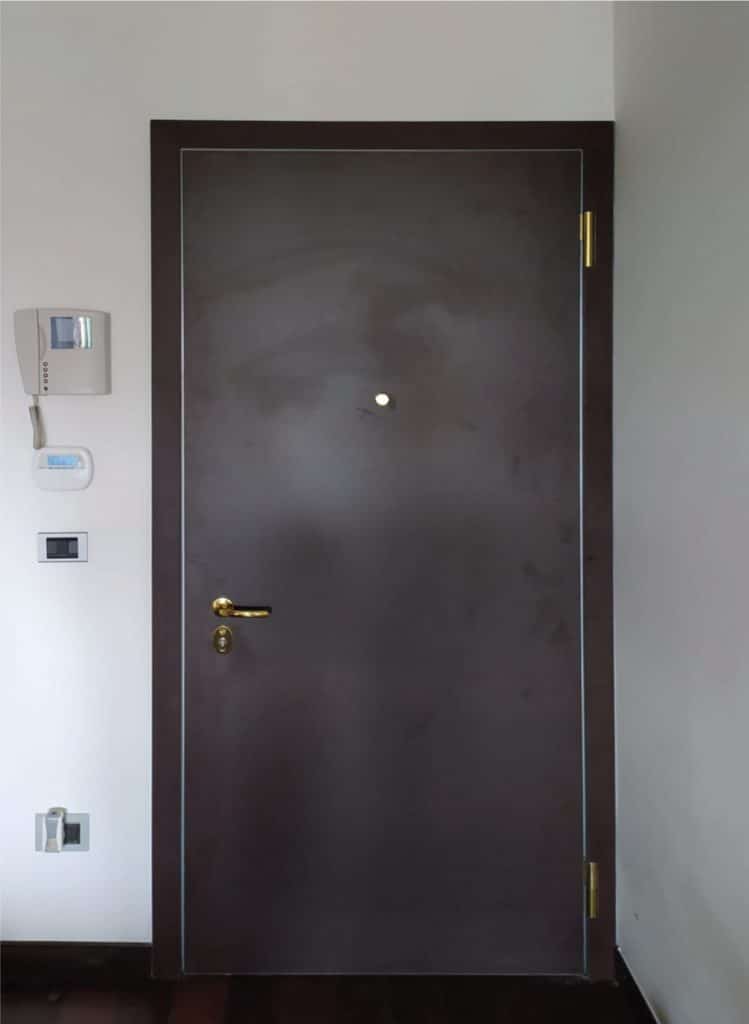
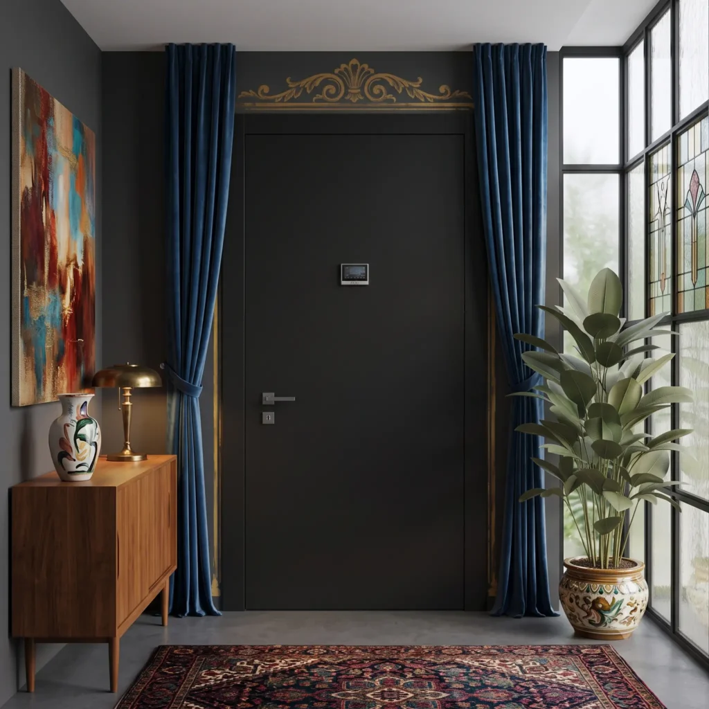

The black armoured door is the boldest and most sophisticated, a confident aesthetic choice that turns the entrance into a focal point.
It is ideal for the minimal chic and eclectic styles, where it acts as a theatrical frame for furniture and objects from different eras.
Against a white wall it creates the sharpest, most modern graphic contrast; set against bright, saturated pop colours, instead, it charges the space with energy.
More on black: perception and history
Black is the experience of the absence of light: a black surface absorbs almost the whole spectrum and sends almost nothing back to the eye. This creates an absolute depth, like a threshold beyond which the gaze loses itself.
Its impact is powerful and sophisticated at the same time. It imposes visual silence and, by cancelling out three-dimensionality, becomes a point of rupture that stirs curiosity.
For centuries it was banished from interiors, tied to mourning and wrought iron. Only with the avant-gardes of the twentieth century and the minimalism of the 1980s did it become a colour of space, a byword for abstract elegance.
Wood effect armoured door
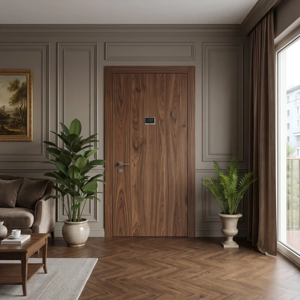
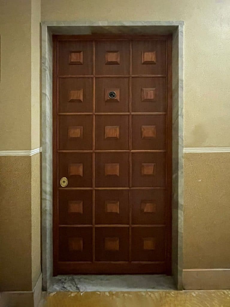
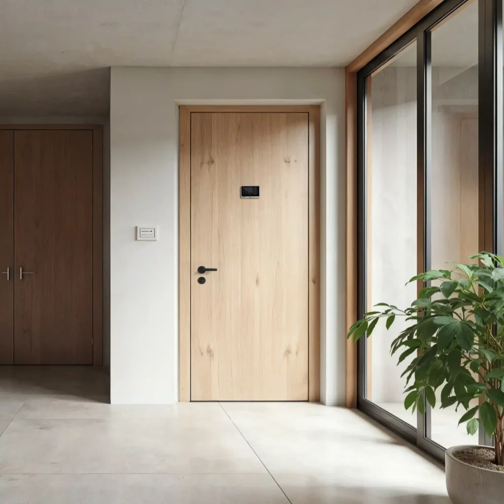
The wood effect armoured door, in shades of brown and walnut, makes the entrance welcoming at first glance, with a warmth you almost feel to the touch.
In dark species such as walnut it gives authority and a classic, solemn feel; in natural or bleached oak it stays bright and suited to modern spaces.
Against a taupe wall it creates an enveloping, monochrome setting; against sage green it turns fresh and botanical, like a contemporary cottage. It looks wonderful with parquet, linen and handmade ceramics.
More on brown and wood: perception and history
Brown is a material colour, almost a tamed red. It is not a pure shade of the rainbow, but the result of a dark, warm surface that the eye reads as thickness and stability.
The mind links it to earth, to bark, to what lasts: it conveys protection and rootedness, a return to solid ground.
With wood, touch comes into play too. The brain joins what it sees to the memory of the grain, and brown becomes a complete sensory experience. It is the colour that has accompanied the classic style for centuries, from panelling to Cordoba leather.
Blue armoured door
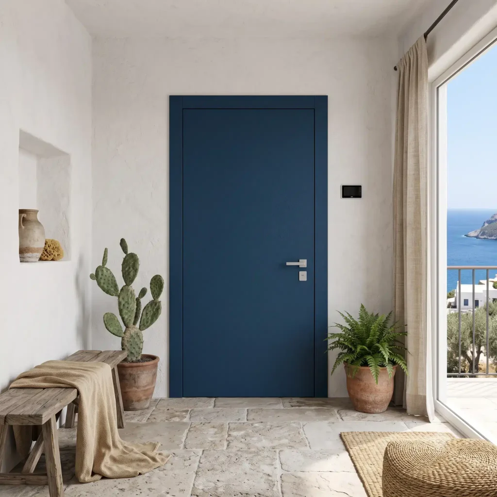
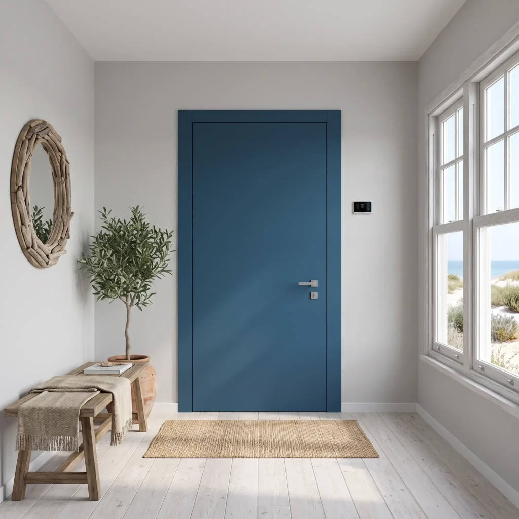
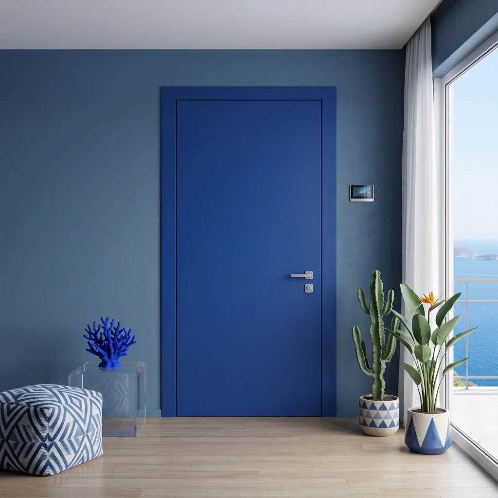
The blue armoured door gives breathing space, calm and depth, and has a particular optical effect: it makes the surface look further away and the space more airy.
It is perfect for the Mediterranean, classic and pop styles. A deep blue with whitewashed walls, natural stone and raw fabrics recalls the sea.
Against a pearl grey wall it becomes an elegant coastal chic; against an air-force blue tone it creates an immersive effect, suspended between sky and sea, while against terracotta it plays on a warm, sophisticated contrast.
More on blue: perception and history
Blue lives at the high frequencies of the visible spectrum. To focus on it the eye relaxes and perceives it as further away: it is the famous depth effect, which makes a wall or a door look optically more distant and the space more airy.
It is the colour of calm and trust: looking at it lowers the heartbeat and invites reflection, without ever being aggressive.
It has a precious history. Until the nineteenth century, ultramarine blue, obtained from lapis lazuli, was worth more than gold and was reserved for kings and churches. With synthetic pigments it became accessible, and with the Scandinavian and Mediterranean styles it became the colour of depth and breathing space we know today.
Green armoured door
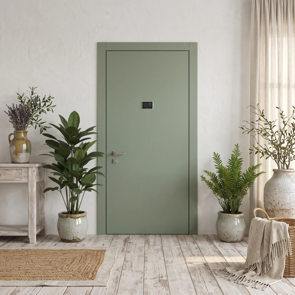
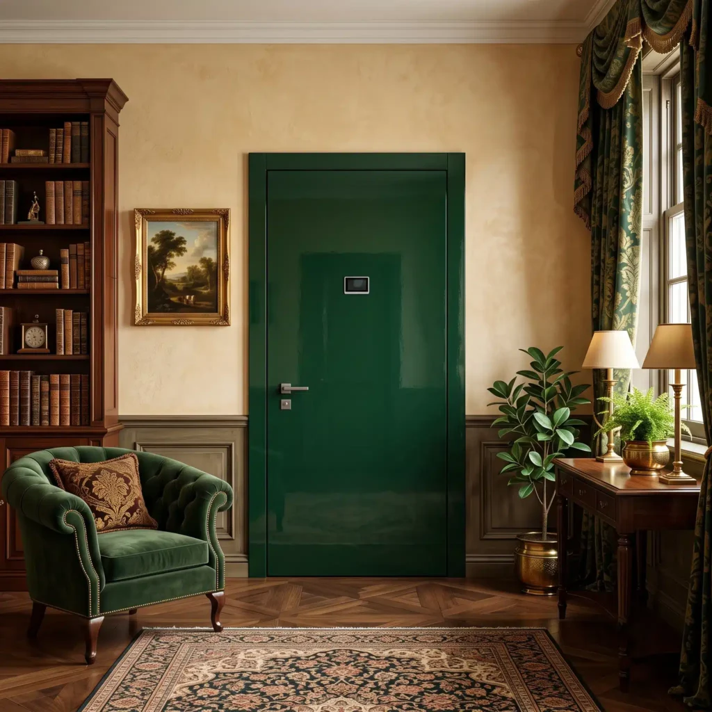
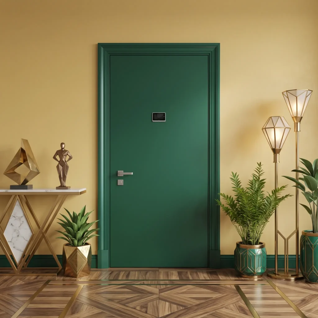
The green armoured door is the one that relaxes the most, because our sight is naturally tuned to this colour: it communicates nature, balance and renewal.
Sage green is perfect for the Provençal and shabby styles; bottle green gives the warmth of an English library, while emerald green with brass details becomes an Art Deco luxury.
Against a white wall it stands out as the sole star; against an ochre yellow it evokes a sun-kissed wood, with a refined rural nostalgia.
More on green: perception and history
Green is the colour our sight is most tuned to. It sits at the centre of the visible spectrum and our eyes focus on it effortlessly: the mind reads it as nourishment, stability and renewal.
It has a measurable relaxing effect: it lowers stress and slows the heartbeat, because for much of our evolution it meant water, food and shelter.
Its history is bound to the plant world. Hugely popular in the eighteenth century as a garden green to bring the outside indoors, in the Victorian era it became the colour of intellectual comfort and connection with nature, which we find again today in biophilic design.
Red armoured door
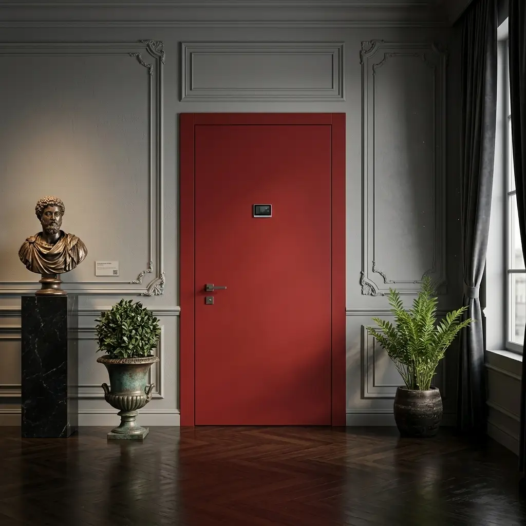
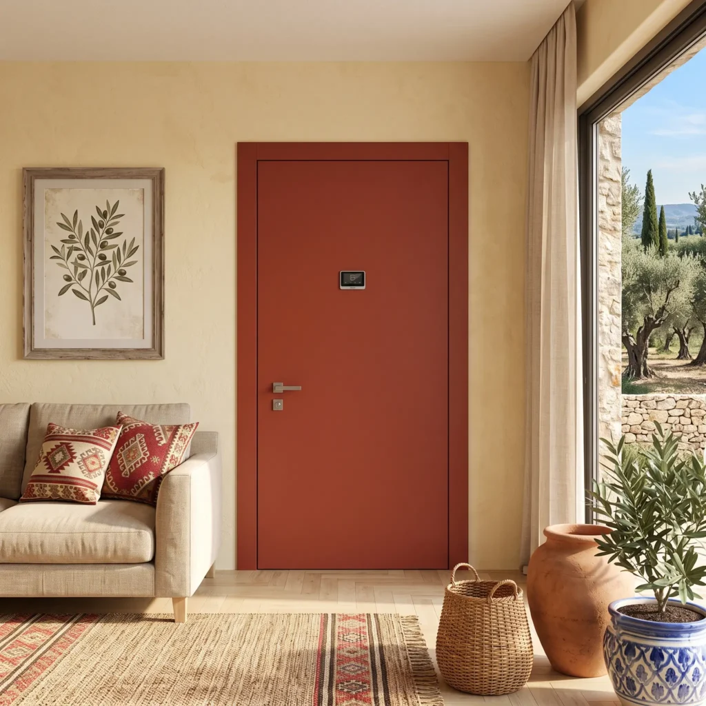
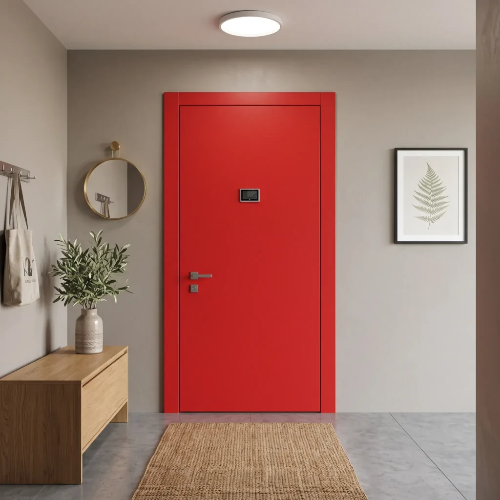
The red armoured door is the most energetic, the colour the brain perceives first: it gives character and warmth to the entrance.
It works well in the bold classic, eclectic and Mediterranean styles, alongside natural materials and handmade textures.
Against a mid grey wall it takes on an almost museum-like, elegant dignity; set against a cream yellow it softens and turns warm and convivial, welcoming from the very threshold.
More on red: perception and history
Red strikes the nervous system before any other colour. It has the longest wavelength in the spectrum, and to focus on it the eye makes a greater effort: so it seems to advance towards us, nearer and more present.
It is the primordial colour of human history: from the ochres of cave paintings to Pompeian Red, right through to the velvets of the European courts, it has always meant life, power and prestige.
That is why, at home, it changes the story of a room: it breaks the stillness of a classic setting and becomes an energetic focal point in a modern space.
Two-tone armoured door
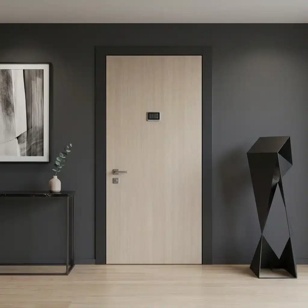
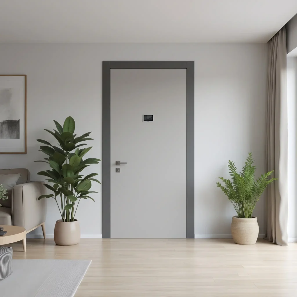
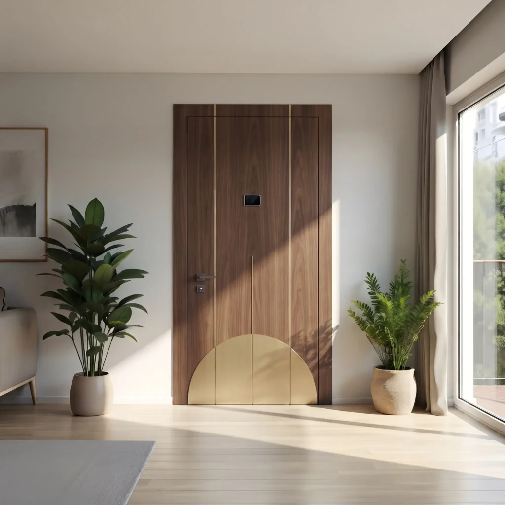
The two-tone armoured door places two shades on the same leaf, usually the frame and the central panel, and creates depth and visual rhythm.
With a tone-on-tone pairing, for example a frame just slightly darker than the panel, you get a harmonious, sophisticated effect, suited to elegant and minimalist styles.
With a sharp contrast between frame and body, instead, it becomes a strong, dynamic graphic element, ideal in bolder, more modern settings.
More on the two-tone door: perception
Placing two shades on the same door multiplies the visual stimuli. The eye, used to reading single volumes, isolates the two areas and perceives the space as a layered composition.
Tone on tone works in a harmonious, reassuring way: a subtle gradation gives depth without the shock of an abrupt change, perfect for elegant and minimalist styles.
A sharp contrast, on the other hand, stirs alertness and curiosity: the graphic break becomes the pivot of the room and instils vitality, ideal in bold styles and Bauhaus-inspired design.
Want to understand which colour and finish truly make the most of your entrance?
Let us talk it through together starting from your home: style, walls, the setting of the landing. Fill in the form with a few details about your home, so we can prepare a serious quote tailored to your case.
With the right details we can recommend the most suitable colour and panel combination, without leaving you to choose blindly.
How to choose the colour of your armoured door
You have seen what each colour communicates. Now a few practical criteria so you do not get the final choice wrong.
This table translates the three most common needs, light, space and maintenance, into the most sensible colour choice. Use it as a starting point, then tailor it to your entrance.
| Your situation | Recommended colour | Why |
|---|---|---|
| Small or poorly lit entrance | White, taupe, light grey | They reflect the light and widen the space |
| Large, bright entrance | Anthracite, black, a bold colour | They add depth and elegance without closing in |
| You want to clean as little as possible | Anthracite, taupe, mid wood effect | They mask fingerprints, dust and small scratches |
| You want the door to be noticed | Blue, green, red or black on a light wall | It becomes the focal point of the entrance |
| You want continuity with your internal doors | The same colour as the doors in your home | The entrance does not clash and looks tidier |
The colour of the armoured door is in the panel, not the structure
The colour concerns only the cladding panel, that is the aesthetic layer that covers the steel structure. The part that stops burglars stays the same whatever shade you choose.
An armoured front door is built in layers: underneath, the security core of steel sheet, frame, lock and locking points, on top the panels that carry colour and finish.
You can afford any colour, from the softest white to absolute black, without giving up a gram of protection. If you want to understand how a door is built layer by layer, read how an armoured door is made.
How to match the door colour to walls, floors and window frames
The door should talk first to the floor, then to the walls. You change the floor once every twenty years, you repaint the walls in a weekend: it is the floor that drives the colour choice.
The key to pairing is the temperature of the colour. With a warm floor (honey oak, walnut, terracotta, golden parquet) choose a warm door such as wood effect, taupe, ivory or warm white; with a cold floor (grey stoneware, bleached oak, marble, concrete) go for anthracite, grey, pure white or blue.
Mixing warm and cold is the most frequent mistake: it is that jarring note you sense but cannot explain, like a golden wood effect set against ash grey parquet.
The colour temperature rule
Match the door to the floor: warm with warm, cold with cold.
Avoid: mixing warm and cold tones
The reasoning reads at a glance in the diagram above.
Indoors, take the other doors in your home as your reference more than the walls. If the internal doors are lacquered white, a white inner side of the front door creates continuity; the walls, instead, change from room to room and would tie your hands.
Use the window frames and metal details as a common thread. If you have windows with anthracite frames, an anthracite door ties the whole home together; if handles and light fittings are matt black, repeat the black on the door handle.
Repeating a colour already present in your home makes the choice look considered and intentional. It is the simplest trick for an entrance that looks designed rather than improvised.
If you go for contrast, make it clean and keep it tidy. A dark door on a light wall only works with order around it, without other strong colours competing; in a small or dark entrance, tone-on-tone harmony is better, as it widens the space.
Before you decide, try the sample in place. Rest a sample of the finish next to the floor and wall and look at it both in daylight and under the evening light: the same anthracite that looks elegant by day can turn into a flat black in the evening.
How much light, space and maintenance matter in the colour choice
Light colours amplify the light and widen small spaces; dark ones give depth but absorb light and hide signs of wear better.
The choice changes depending on how bright and large your entrance is.
Dark shades and mid tones mask fingerprints, dust and small scratches better than very light shades.
A pure white is beautiful but flags up every fingerprint, so it needs cleaning more often with a soft cloth and a neutral detergent.
If you are after the colour that shows the least dirt in everyday use, lean towards anthracite, taupe or mid wood effect.
The two sides of the armoured door: inner and outer colour
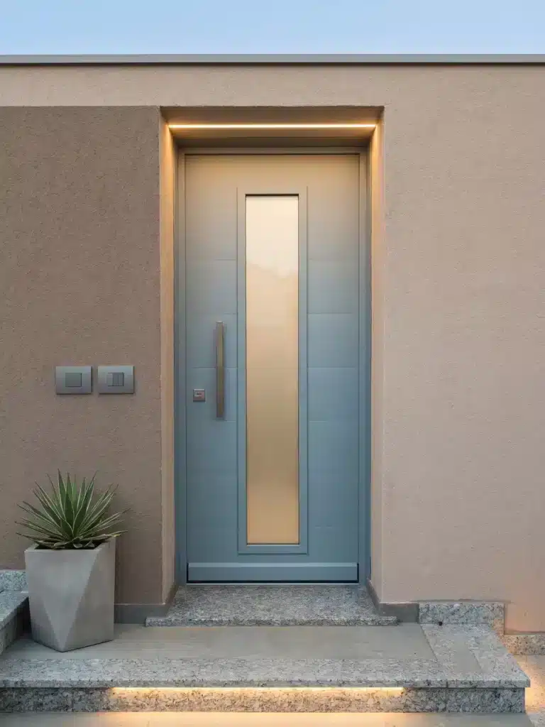
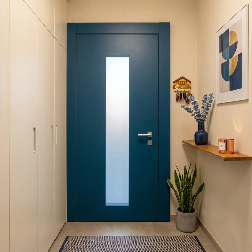
Armoured door with glass. Grey panel outside, blue panel inside
A front door has two faces and they can have two different colours: the inner side talks to your home, the outer side to the landing or the facade.
They are two worlds with different needs.
Inside, the colour ties in with walls, floors and internal doors.
Outside, what matters is the setting of the block of flats and, for detached houses, the facade and the external window frames.
Our in-house joinery reproduces the existing communal panel, so the outer side stays identical to the others and you personalise the inner one as you wish.
It is the same craftsmanship that lets us work where the constraints are strict, as with armoured doors for historic buildings.
Materials and finishes of the coloured panel
Colour is not everything: how the finish is made matters too, because the look and the durability depend on it.
The same shade changes appearance and wear on a lacquered, laminate or wooden panel.
| Finish | Look | Where it suits | Maintenance |
|---|---|---|---|
| Matt or gloss lacquer | Full, even shade, almost any RAL | Modern interiors, full colours | Soft cloth; gloss marks more |
| Laminate | Wood effect or shade at a low cost | Interiors and sheltered exteriors | Easy, resists scratches well |
| High-pressure laminate | High resistance to the weather | Outer sides exposed to sun and rain | Very easy, holds the colour |
| Solid or veneered wood | Natural, warm grain | Classic, made-to-measure style | Periodic, vulnerable to damp if untreated |
For the inner side you can be daring with any shade: lacquer reproduces virtually any RAL code, laminate gives the wood effect at a low cost, real wood brings warmth and grain.
For a highly exposed outer side, high-pressure laminate is the most resistant, because it stands up to sun and rain and holds the colour over time.
On texture, finally, a smooth panel enhances full colours and minimalist styles, while a routed or engraved one creates plays of light that make light tones such as white look less flat.
Can I repaint the armoured door panel myself?
It is the question of someone with an armoured door still in good shape but with a colour that is now dated or damaged.
Repainting the panel yourself is almost always inadvisable: laminate or melamine-faced panels are not made to be brush-painted, and the result tends to blister, streak and peel within a few months.
The panel’s original finish is industrial, applied to smooth surfaces that do not hold home-applied paint well.
On solid wood panels a professional job of sanding and repainting is possible, but it is a joiner’s job, a long way from an afternoon of DIY.
The most sensible route is to replace the panel with a new made-to-measure one in the colour you want, keeping the same armoured structure.
You give it a new outfit without touching the body of the door.
Anyone with a front door dated enough to want to repaint it, though, usually also has an old frame, seals and insulation, so it is worth considering replacing the whole door.
With a new door you recover colour, insulation, security and gain access to the Italian Renovation Bonus.
Conclusions
The colour of the armoured door is a free and important choice, because it does not affect security but defines the mood of your entrance every day.
You can be as daring as you like without giving up anything in protection.
Start from the colour you love, check that it talks to your walls, floors and home style, and remember that the door has two sides to think about together.
Are you thinking of replacing or fitting an armoured door and want to get the colour and finish right?
At Ariete we design and build the complete door, with one of our consultants to help you choose the right shade. Request a quote for your armoured door.
Frequently asked questions
Practically all of them, because the colour is the finish of the panel and has no security limits. They range from the most requested neutrals such as white, anthracite grey, taupe and beige, to wood effects such as oak and walnut, right through to full colours such as blue, green, red and black. With lacquered finishes you can aim for a precise RAL shade, so in practice almost any colour.
Yes, but by changing the panel, not by repainting it. The correct way is to replace the cladding panel with a new one in the shade you prefer, leaving the armoured structure untouched. Painting over the existing panel almost always gives poor, short-lived results.
Yes, and it is the norm. The door has two independent faces, so you can have an inner side matched to your home and an outer side coordinated with the landing or the facade. In blocks of flats with the same panel for everyone, the door is made with the outside identical to the others and the inside personalised.
Dark shades and mid tones. Anthracite, taupe and mid wood effects hide fingerprints, dust and small scratches far better than pure white, which instead highlights every mark and needs more frequent cleaning with a soft cloth and a neutral detergent.
Hardly ever. DIY on laminate or melamine-faced panels leads to blisters, peeling and streaks in no time, because they are not surfaces meant for brush paint. If you no longer like the colour, replacing the panel or the whole door gives a clean, lasting result, and on a very old door you also recover insulation and security.
As a rule, little. Standard shades and finishes are usually already included, while special finishes can add to the cost, such as some fine wood effects, RAL shades outside the standard chart, two-tone or routed work. The biggest weight on the price stays the security class and the structure, not the colour.
It depends on the finish. Laminate and high-pressure laminate panels hold the colour well, even on the outer side exposed to sun and rain. Painted wood may need periodic maintenance, while indoors, sheltered from direct light, practically all finishes stay stable for a long time.
Yes, but the two sides are treated differently. The inner side you personalise as you wish; the outer side must respect the block’s regulations, which often require the same panel for all the doors on the landing. In that case the communal panel is reproduced identically on the outside and only the inside is changed. For more information, read the article on replacing the armoured door in a block of flats.
